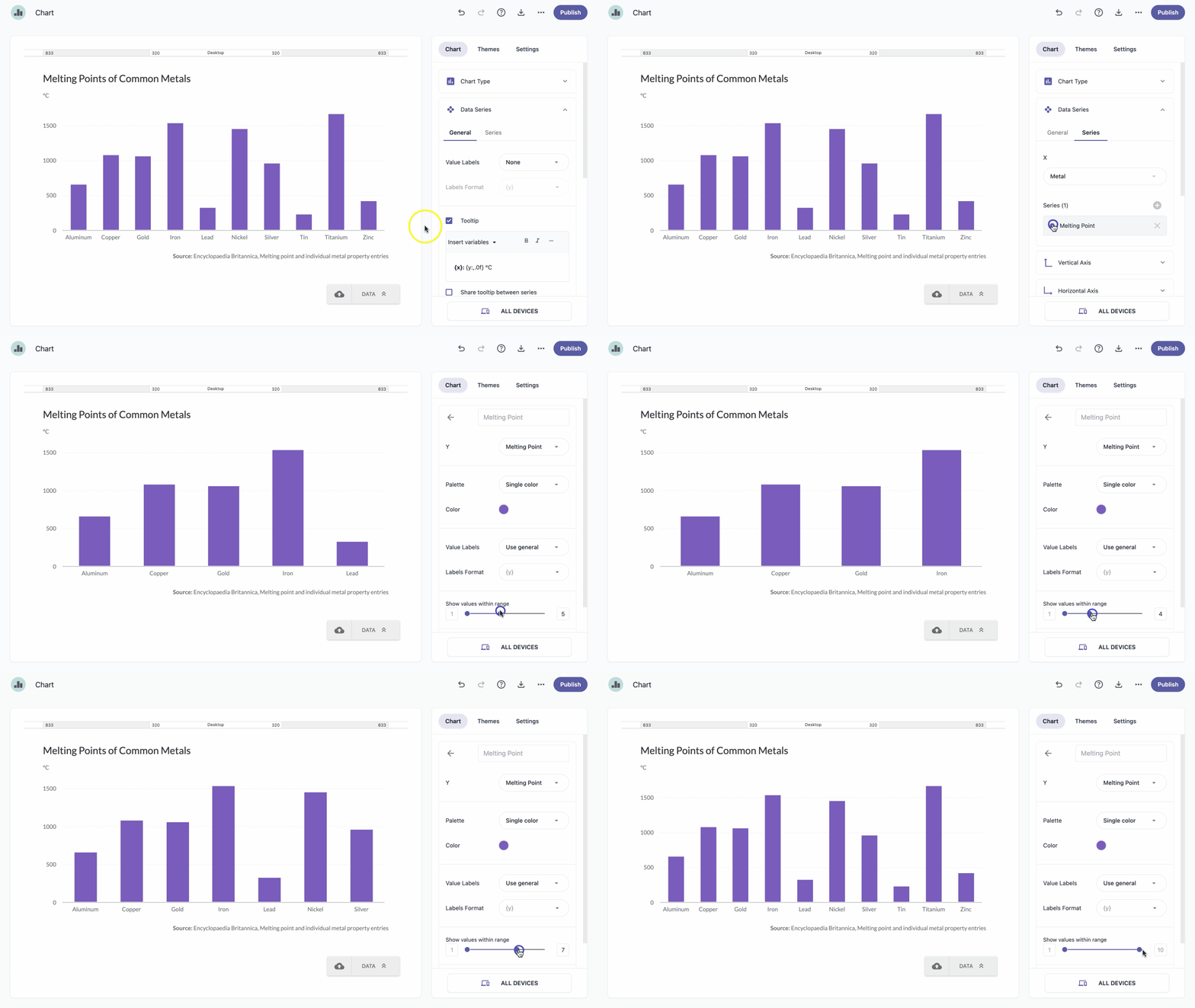
Data Series is a row or column of numbers that are graphed in a chart. It allows you to choose a set of values from a dataset and plot them on a chart. If you want to graph only a snippet of the data in the column, you can set a series range and visualize only values in that range.
- In the chart panel, click Data Series to open the dropdown menu.
In the Series tab, click the series to expand it.
Note: A quicker way to select a series is to click on it directly on the chart. Under Show values within range, use the slider to define the range. For example, if you select a range 1–3, only the first 3 rows from the table will be visualized.
Note: Changes are applied instantly, so you can view updates in real-time.