Axes provide quantitative and categorical scales used to label and assign values to the visual elements on a chart. The X-axis represents categories, while the Y-axis indicates the scale and units of measurement. Here's what you need to know about setting up the horizontal (X) axis in most chart types.
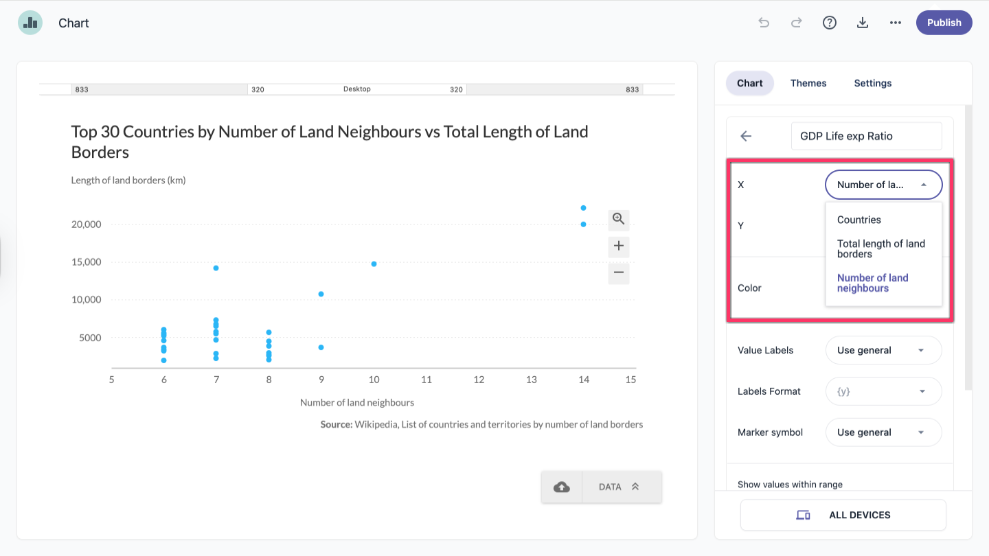
- In the chart panel, click Data Series to open the dropdown menu.
- In the Series tab, click the X-axis title to open the dropdown menu.
- Select the series you want to use as the X-axis.
Set value of horizontal (X) axis in Scatter and Bubble charts
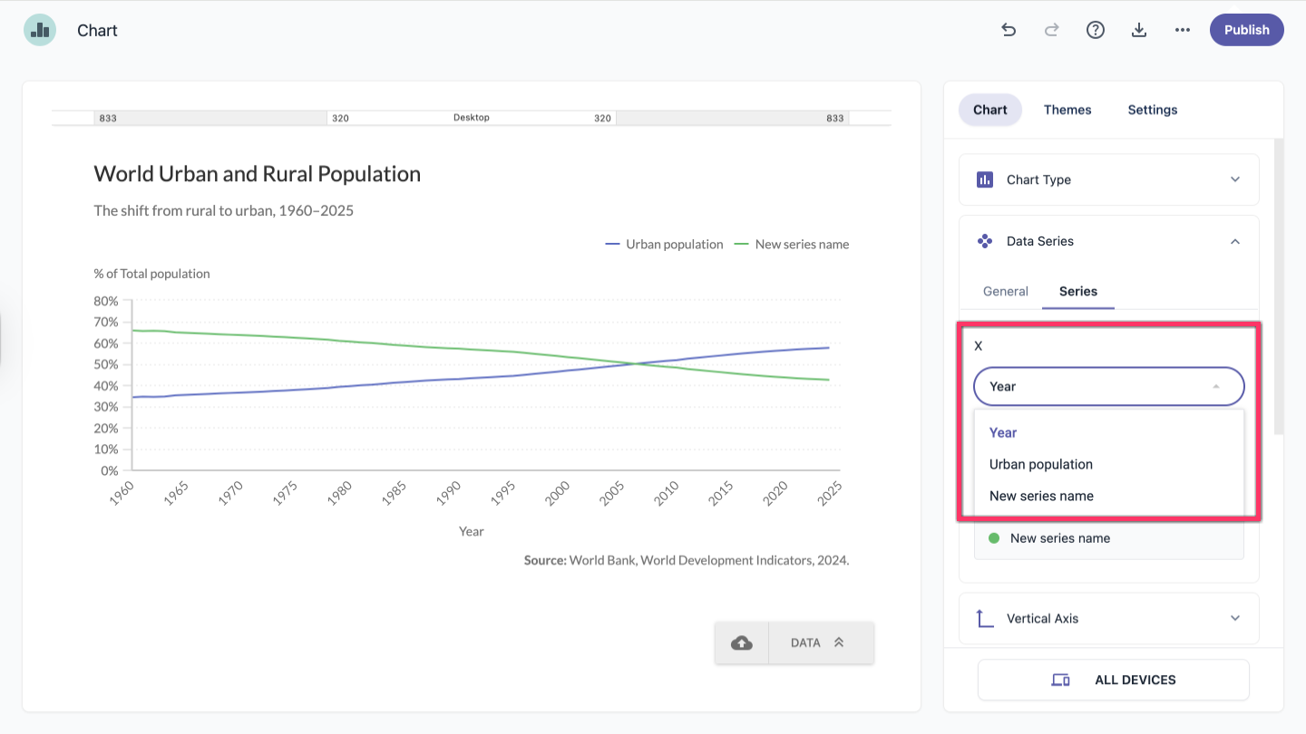
For Scatter and Bubble chart types, the horizontal axis is set within the individual series settings.
- In the chart panel, click Data Series to open the dropdown menu.
- In the Series tab, select the series you want to edit.
- From the X dropdown, choose the column to use as the horizontal (X) axis for that series.
| Note: A quicker way to select a series is to click it directly on the chart. |