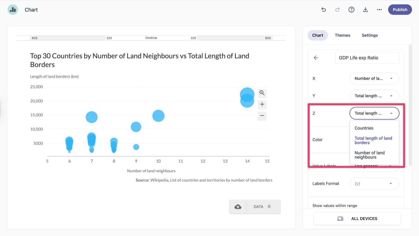
A bubble chart is similar to a scatter chart, but data points are represented as bubbles. It also introduces a third dimension, typically shown by the size of the bubbles. This means each data point includes three values: X, Y, and Z.
- In the chart panel, click Data Series to open the dropdown menu.
- In the Series tab, click the series to expand it.
- From the dropdown next to Z, select the column you want to use as the Z-axis.
| Note: A quicker way to select a series is to click it directly on the chart. |