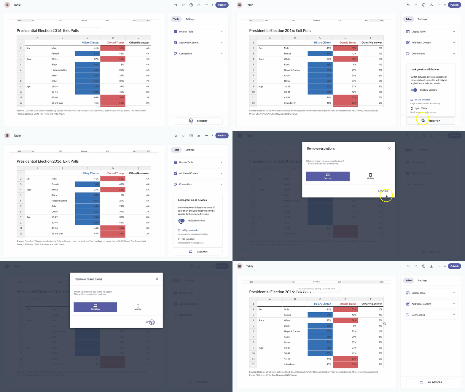
When creating a table, keep in mind it will be viewed on devices with different screen resolutions, and some tables may become unreadable on smaller screens. Table lets you set up separate configurations for different screen resolutions to ensure good readability on every device.
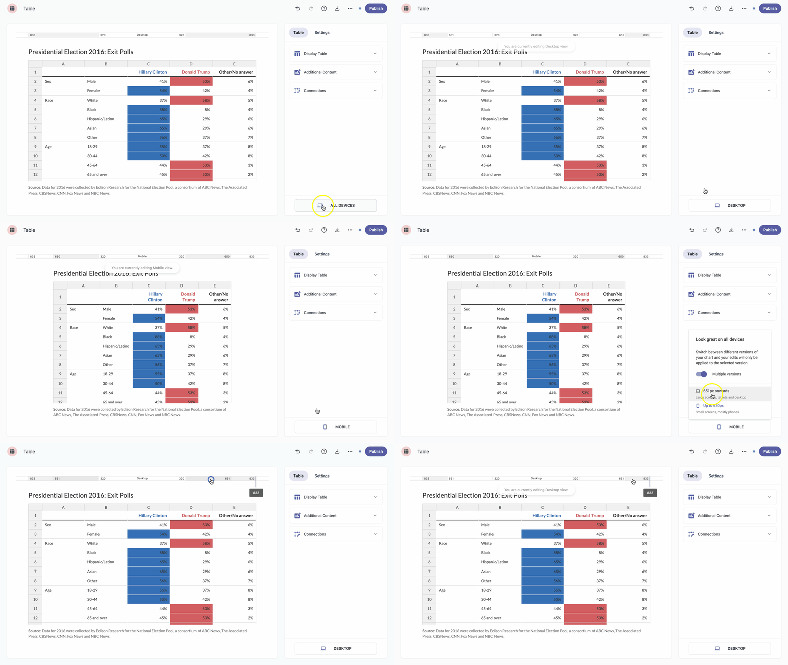
Toggle on multiple versions
- At the bottom of the right-hand sidebar, click the devices icon .
- Toggle on Multiple versions.
Start editing the configuration for the default resolution.
Note: The default resolution is set to Desktop view. - To switch to Mobile view and customize the mobile version of your table, click the desktop icon in the bottom-right corner and choose Up to 650px.
Customize the mobile version just as you would the desktop version.
Note: You can change the chart type for the mobile version if you think another option would work better for smaller screen resolutions. Note: Use the resizing line on the chart to preview how it will appear at different screen sizes. - Choose which version will be the default: Desktop (651px and above) or Mobile (up to 650px).
| Note: You can also switch quickly between Desktop and Mobile view by selecting the resolution on the resizer. |
Toggle off multiple versions
If you no longer need separate versions for desktop and mobile, you can turn multiple versions off.
- At the bottom of the right-hand sidebar, click the devices icon .
- Toggle off Multiple versions.
- Select the version you want to keep.
- Click Confirm.